Guidelines for Creating Print Files
FORMAT
We recommend sending files in in unprotected VECTOR PDF format.
PDFs generated from Photoshop are NOT vector as they are rasterized. Image files (.jpeg, .png, .tif, psd) will be accepted after evaluating the quality, which will always be inferior to a vector file.
The optimal resolution for image files is 300 dpi..
If images are included in a PDF document, it is recommended to embed them in the same document

COLORS
RGB, CMYK, Pantone
The same color may appear slightly different depending on the printing medium. This is due to the physical composition of the material chosen for printing.
All files should be sent in MCYK (ccyan, magenta, yellow, black) assigning the Fogra 39 color profile. Images in RGB or with PANTONE colors will be automatically converted with a standard separation profile.
Therefore, we advise working directly with a CMYK color profile to avoid unwanted results after conversion.
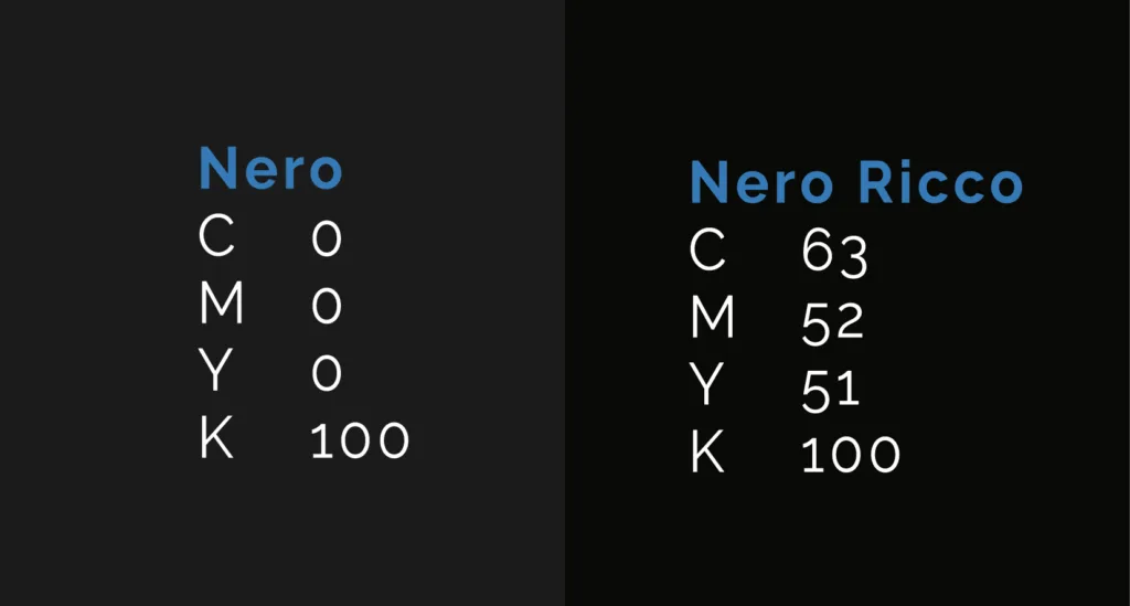
BLACK
To achieve a rich black with our printing technology, we recommend using a four-color mix corresponding to C63%, M52%, Y51%, K100%.

ATTENTION
The same color may appear slightly different depending on the printing medium. This is due to the physical composition of the material chosen for printing.
FONTS
Fonts should be embedded in the PDF or (preferably) converted to curves/paths.
Remember that any effects or alterations to the texts or graphics should be “fixed” using the “expand” command.
The minimum font size (below which we cannot guarantee perfect print quality) is 6 pt. In the case of text placed on backgrounds composed of more than one color, the minimum font size is 8 pt although this will be evaluated on a case-by-case basis as quality also depends on other factors such as the type of font used..
The minimum printable line width is 0.25 pt.
DIMENSIONS AND MARGINS
The file must be at a 1:1 scale and include a minimum of 2 mm bleed per side. It is recommended not to place texts or graphic symbols beyond the safety line.
Example:
Finished label size: 50x50mm
⬤ Bleed line
54x54mm
2 mm beyond the cutting line for each side. The background graphics should continue in this area.
⬤ Die-cut
50x50mm
Cutting line, i.e., the perimeter of the finished label.
⬤ Safety margin
46x46mm
2 mm inside from the cutting line for each side. Do not place texts or graphic symbols beyond this line.
Any border frames on the label should be at least 2 mm thick.


DIE-CUTTING
On Illustrator, you can create a die-cut by following these simple steps:
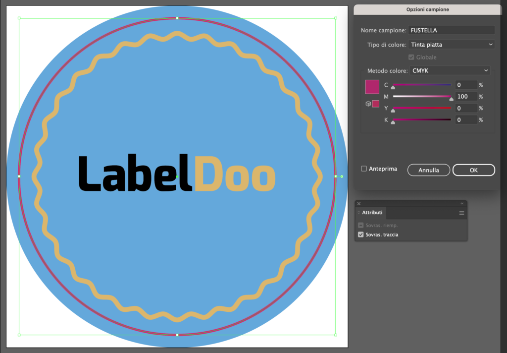
- Create a new color sample in the Swatches palette named DIE-CUT.
- Select Spot Color as the color type and assign CMYK percentages: 0, 100, 0, 0.
- Apply the “DIE-CUT” color to the die-cut path and select the “overprint stroke”attribute.
ATTENTION
Do not create overly complex die-cuts, as the cutting result might be imprecise and uneven.
The “DIE-CUT” path must be constructed from a single closed line.

Correct

Too complex

Too sharp angles

Open line
ENHANCEMENTS
On Illustrator, you can indicate an enhancement through these simple steps, keeping in mind that they apply to any type of enhancement (Hot Stamping, Screen Printing Relief, 3D Foil):

HOT FOIL STAMPING
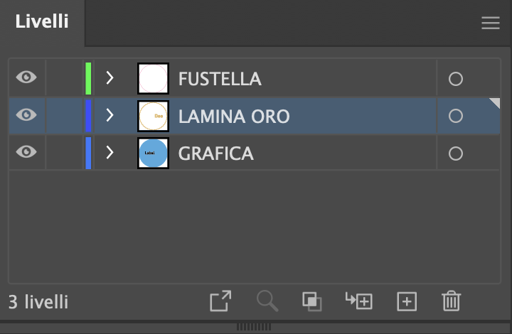
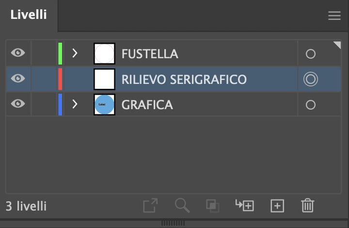
1. Divide the elements in the file into different layers:
- What needs to be printed in four-color process goes in a layer called “GRAPHICS”;
- All elements in hot stamping go in a new layer called “GOLD FOIL”, which is placed above the GRAPHICS layer.
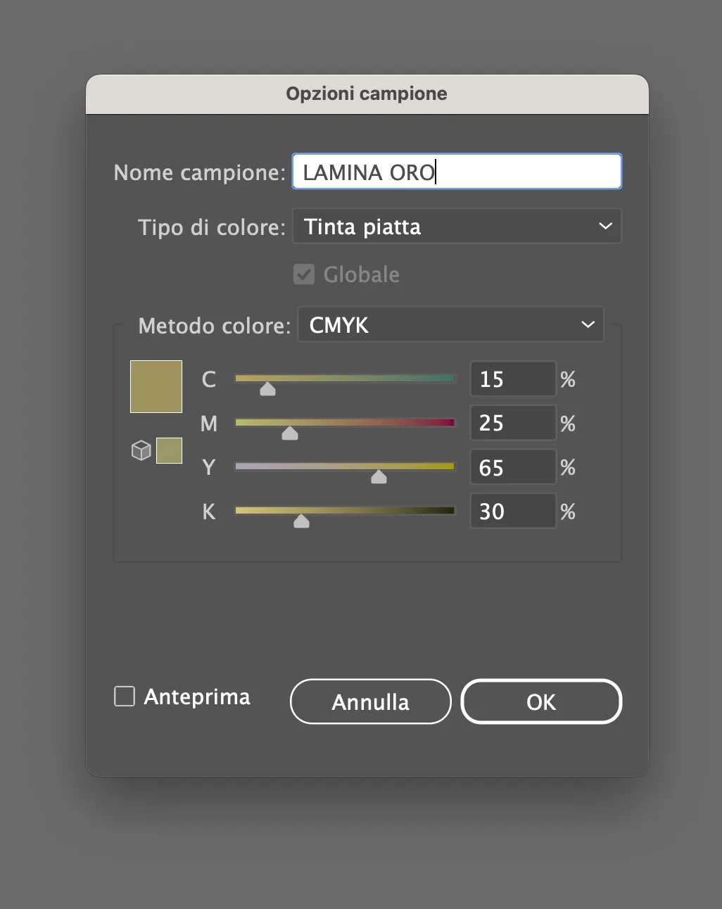
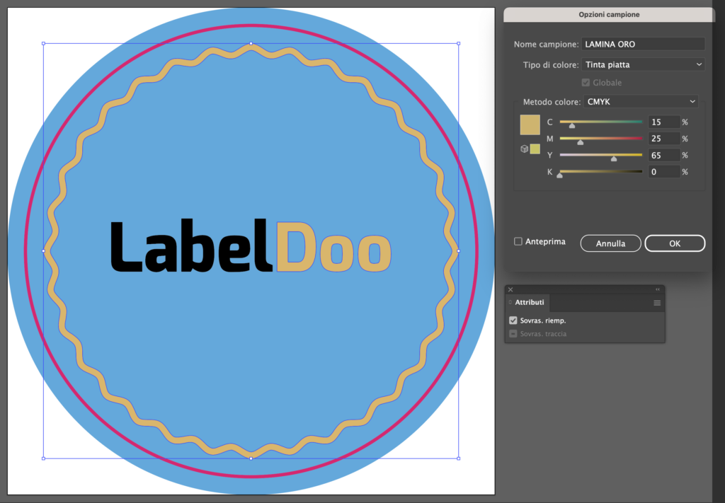
2. From the “SWATCHES” palette, create a new color sample named “GOLD FOIL”, select Spot Coloras the type of color, and assign four-color percentages that simulate the color of the foil (e.g., for gold CMYK: 15, 25, 65, 0)
3.Assign the newly created “GOLD FOIL” Spot Color to the elements to be laminated in the “GOLD FOIL” layer and apply overprint
(both on the fill and stroke if both are present).
4. Save the PDF in high resolution, keeping the layers separate.
ATTENTION
Graphics dedicated to processing must be inserted in specific layers named after the color of the enhancement,
in this case,GOLD FOIL.
Graphics in the enhancement layers MUST NOT CONTAIN GRADIENTS, SCREENS, OR TRANSPARENCIES, must be vectorial,and use a flat color sample with the same name as the enhancement it refers to.
Enhancements can take any shape you desire for greater creative freedom, but keep in mind that the minimum printable font size is 8 pt, while the minimum printable line width is 1.5 pt.
Note: It is preferable not to place enhancements near the edges, to avoid breaking the varnish or lamination. Always leave 2 mm of margin between the enhancements and the die-cut, or place them “to the edge”.
SCREEN PRINTING RELIEF
1.Divide the elements in the file into different layers::
- What needs to be printed in four-color process goes in a layer called “GRAPHICS”;
- All elements that will be in relief are DUPLICATED and inserted in a new layer called “SCREEN PRINTING RELIEF” and
placed above the GRAPHICS layer (If you want relief without any graphics underneath, instead of duplicating, place the elements directly in the layer).
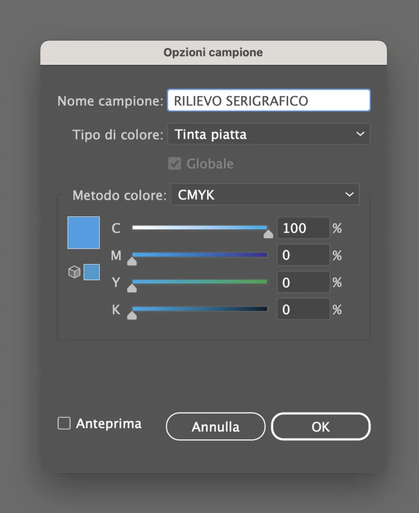
2. From the “SWATCHES” palette, create a new color sample named “SCREEN PRINTING RELIEF”, select Spot Color as the type of color, and assign cyan CMYK percentages: 100, 0, 0, 0.1.Let’s divide the elements present in the file into different levels:
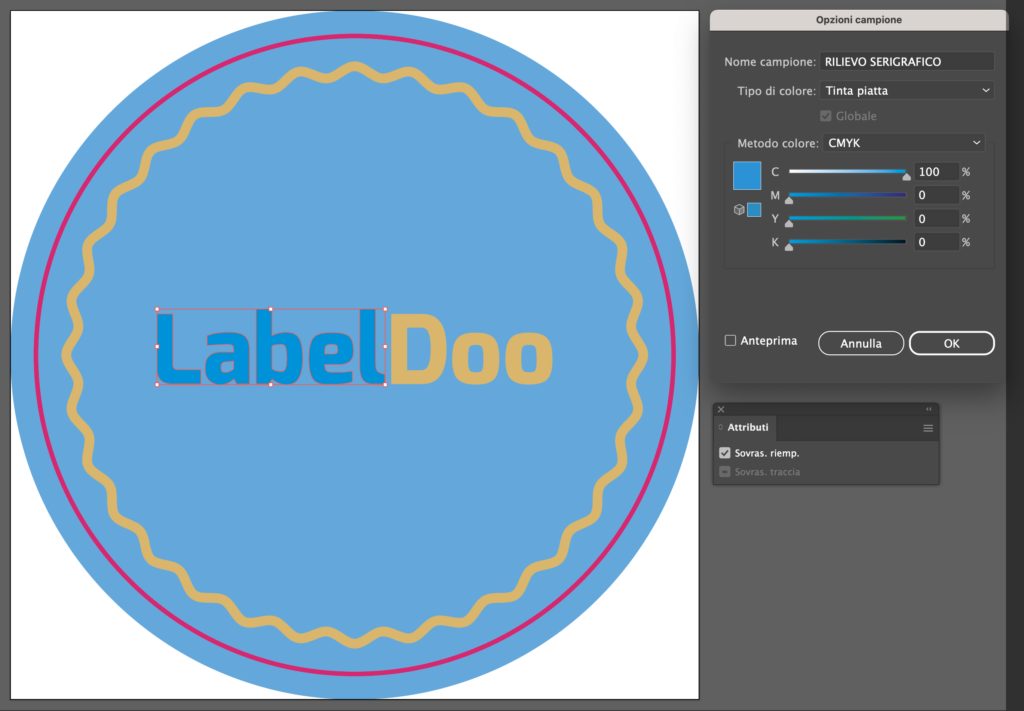
3. Assign the newly created “SCREEN PRINTING RELIEF” Spot Color to the elements to be enhanced in the “SCREEN PRINTING RELIEF” layer and apply overprint (both on the fill and stroke if both are present).
4.Save the PDF in high resolution, keeping the layers separate.
ATTENTION
Graphics dedicated to processing must be inserted in specific layers named after the color of the enhancement, in this case, SCREEN PRINTING RELIEF.
Graphics in the enhancement layers MUST NOT CONTAIN GRADIENTS, SCREENS, OR TRANSPARENCIES, must be vectorial, and use a flat color sample with the same name as the enhancement it refers to.
Enhancements can take any shape you desire for greater creative freedom, but keep in mind that the minimum printable font size is 8 pt, while the minimum printable line width is 1.5 pt.
Note: Screen printing relief cannot be placed close to the cutting line; it must stop at least 1 mm from it..
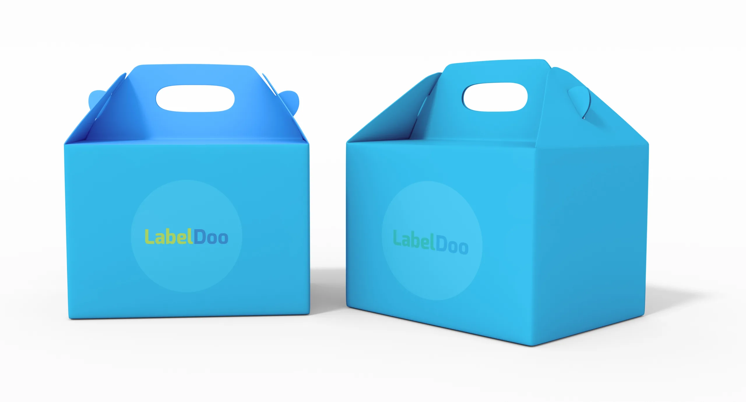
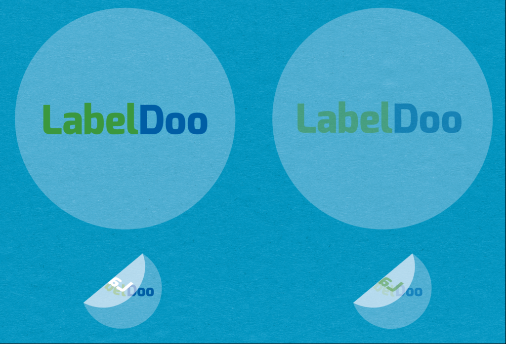
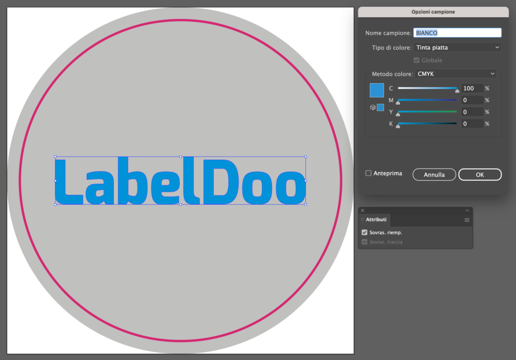
CREATING WHITE FOR PRINTING ON TRANSPARENT OR METALLIZED SUPPORT
We remind you that printing colors are not opaque, so for printing on transparent or metallized supports, it’s necessary to create the white color for any white texts and as a base for all other colors (see example below). Additionally, you can use white to “shield” the support, leaving it “free” where you want it to be transparent or metallized in the case of a metallized support.
Here’s the procedure to follow in Illustrator for preparing a file for printing on transparent or metallized support:
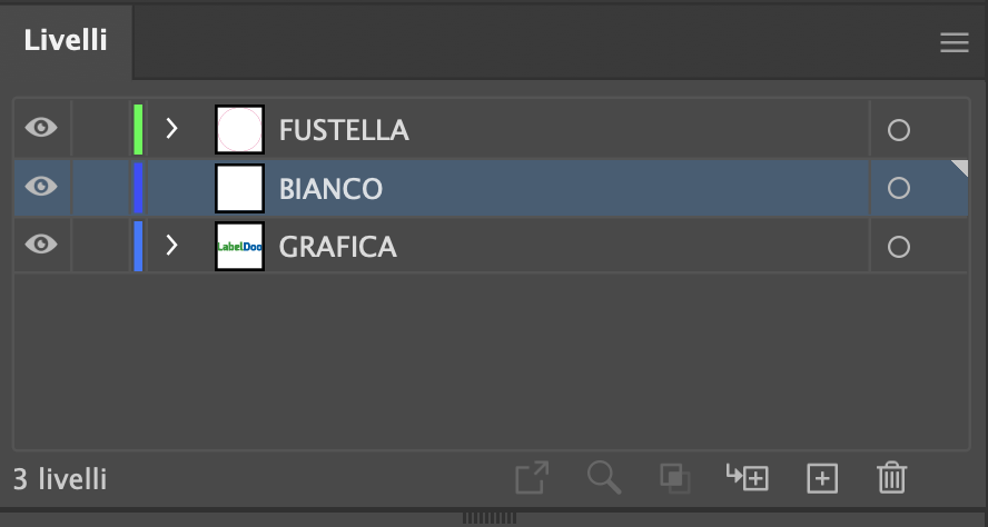
1.Insert your graphics in a single layer, naming it GRAPHICS. From the LAYERS palette, create a new layer above the GRAPHICS layer, naming it WHITE. ATTENTION: keep the WHITE layer above the GRAPHICS layer.
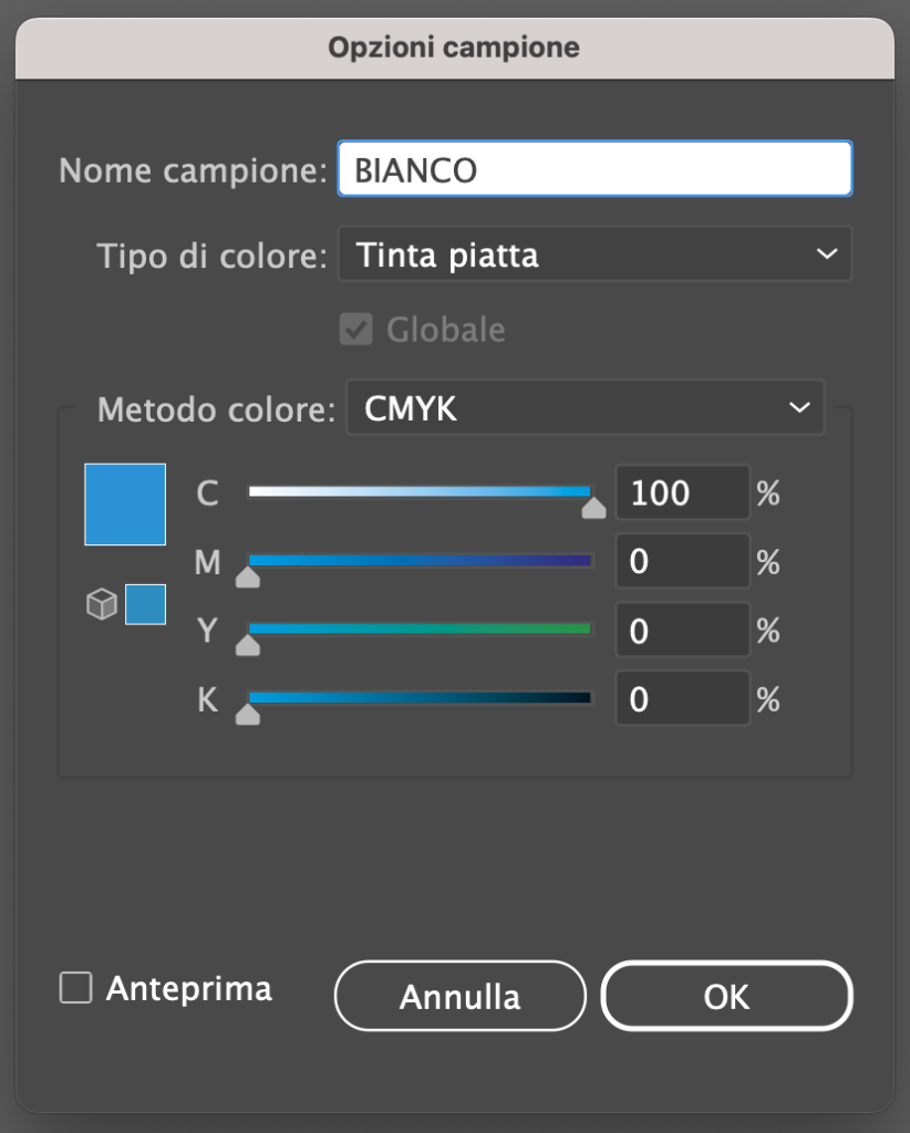
2.From the SWATCHES palette, create a new color sample named WHITE; select Spot Color as the type of color and assign CMYK percentages: 100, 0, 0, 0..
3.On the “WHITE” layer, duplicate all elements from the “graphics” layer that need to be white or that require a white base to optimize their chromatic yield (see example above). Assign the newly created (or duplicated) elements on the “GRAPHICS” layer the flat color WHITE nd overprint in both the fill and stroke (if present).
Save the PDF in high resolution, keeping the layers separate.